Ah, the agency holiday card kickoff.
The directive is always the same, “We want something totally off-the-wall, Big Concept, with bleeding edge tech, that will blow away our clients, and make X Competitor scratch their eyes out with envy. AdWeek should be begging us to publish this baby. You have three days and your budget is whatever’s left on this Home Depot gift card.”
And the dirty secret creatives will never tell you is that under their passive aggressive crabbing about deadline and budget, they are SECRETLY THRILLED. Anyone worth their salt in this industry loves the opportunity to pitch wild ideas and try to one-up their arch nemesis at the agency across town.
Our creative team is no different. Call us cocky, but we love every single thing we came up with for the 2017 Holiday Card and we refuse to let our darling concepts go into that cold dark night of the Box Archive without showing them off.
The Process
What happens when you put a talented designer, an innovation-hungry technologist, and a dark-souled creative lead in a room together with a directive to “make the season merry and bright”? A lot of terrible, impossible-to-execute ideas are generated, along with a couple good ones.
What we eventually pitched was the Classic Three of Creative: the safe, completely in scope idea, the wee push idea, and the “you didn’t ask us for anything like this, and it’s not just out of the box, it set the box on fire, threw it off a bridge, and took the box’s girlfriend out for a nice seafood dinner” idea.
Creative team leaders can debate endlessly about the “right” order to present this range of ideas to the client. Most agree if you’re going to bring a “box burner” it’s best to start with that, get all the fainting and screaming out of the way, then give the more conservative options to calm ‘em down and pull them off the window ledges. Hyperbolic? Perhaps. But I imagine the first time an ad agency told ExxonMobil they needed a Twitter account someone got slapped right in the face.
With the CEO in the room we started with the box burner: transforming our new office building into interactive email experience. When you think about it, this idea shouldn’t be revolutionary. However, the realities of coding interactive emails so they render appropriately across email servers has kept this from becoming a more standard practice for marketers (especially in B2B—*Outlook Fist Shake*).
But we keep seeing exciting examples of interactive emails, and even more exciting open rates and engagement levels. For example, Ticketmaster sent an email with an interactive poll before the MTV Video Music Awards. Subscribers could vote for their predicted winners in the email, then see how others voted on a results page. This email got 182% more opens than their average email.
The Guts
The creative and tech teams couldn’t ignore results like that – and neither could our CEO – especially when we presented a prototype of how we’d bring an interactive gingerbread house to life.
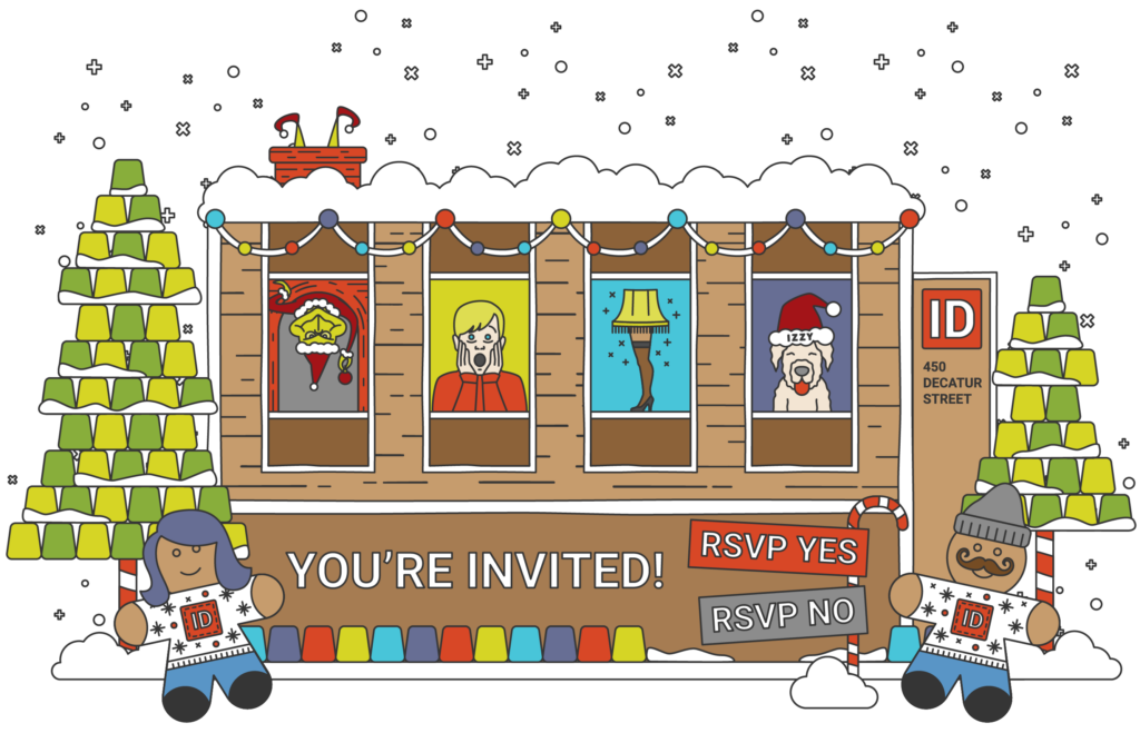
And folks, this wasn’t just any old gingerbread house. In fact, the “house” wasn’t a house at all. Like I mentioned earlier, it was a digitized gingerbread version of ID’s new building – complete with dancing gingerbread men, falling snow, spinning candy, and some of the most well-known Christmas movie characters peeping through the windows. Email recipients interacted with the gingerbread office by hovering over or clicking on the windows to reveal the Grinch, “Kevin” from Home Alone, or the infamous leg lamp from A Christmas Story. And even Izzy, ID’s office dog, hid behind the last window.
You wanted a digital holiday party invitation and a corresponding direct mail holiday card? How about an interactive email where guests can RSVP directly from their inbox? Boom!

It was going to be glorious, but to make it happen, we knew there’d be some hurdles to jump through to get it right. Given the amount of interactivity involved, we knew we’d have to test its functionality a lot. And test we did. We used Litmus to run test in 12 different desktop environments, 12 unique mobile environments, and 16 different web-based email clients.
From the tests, our web developer, Matt Ondo, learned there were some email clients (i.e. Gmail and Outlook) that didn’t support our interactivity, so he and designer, Julie Carter, planned out an alternative “hover state” option. And as a greater fail proof, recipients who couldn’t see the interactivity in other email clients or smartphone apps could click on a “View in browser” to experience the email as intended.
The Glory
And the results were outstanding, nearly every metric doubled compared to our 2016 static ecard:
| 2017 Metrics | 2016 Metrics |
| 61% Opens 24% Clicks 39% Click-to-Opens | 25% Opens 6% Clicks 22% Click-to-Opens |
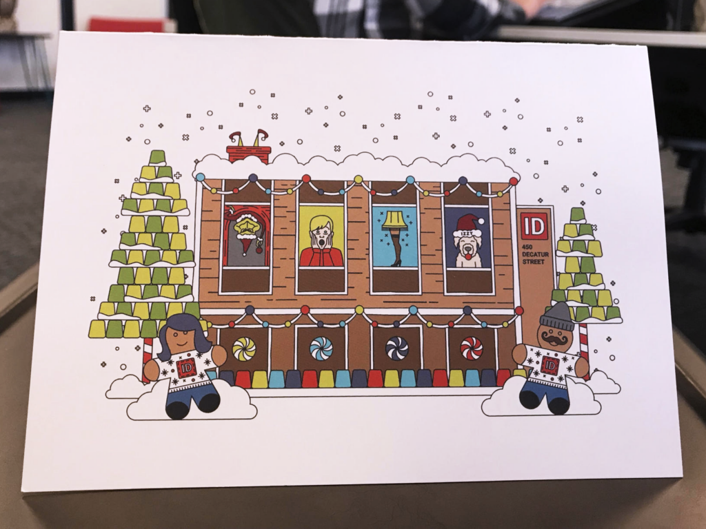
Going back to the initial ask, we also created a matching print version of the card to send out to our extended ID family (those clients and vendors who don’t live in close proximity to our Denver location.)

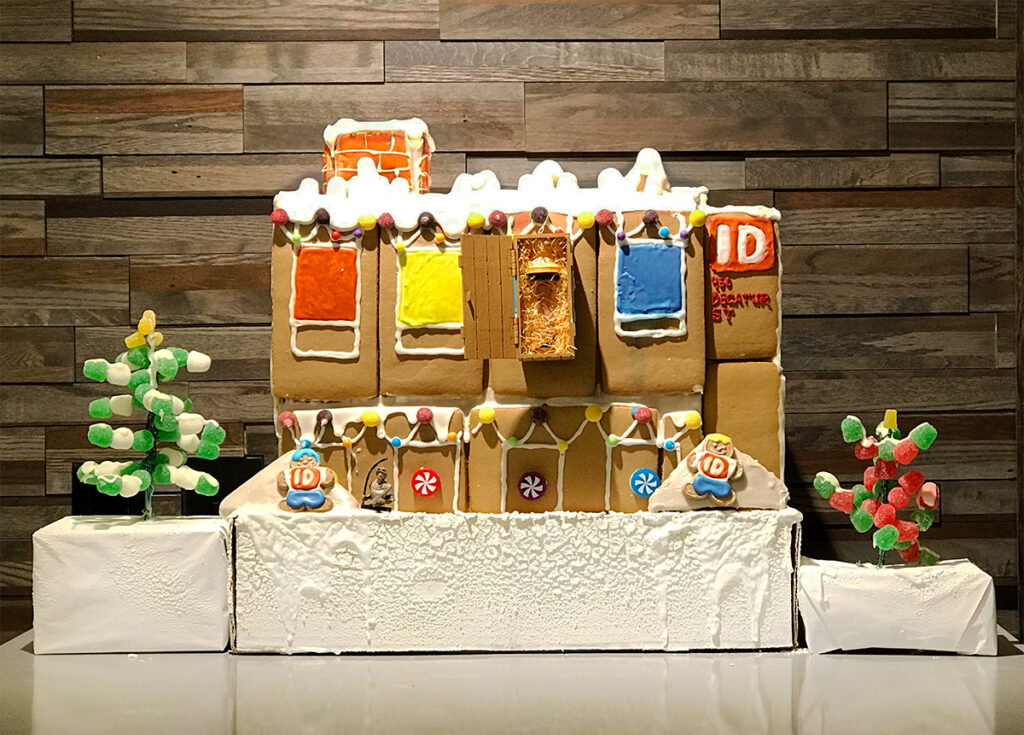
And then, we took it one giant step forward — we built an actual replica of the house, and we put it on display for our holiday decorating party.

Although we were thrilled with the jump in statistics, the real win was how many of our clients interacted with the email, how many of them came out to our holiday party, and how we gained a new progressive capability to offer our clients.
We’re starting the New Year with a clean slate. So, goodbye old Gingerbread house. It’s been grand, but we’re moving onto bigger, better, and more creative projects in 2018.


